NYC Airbnb EDA
Exploratory Data Analysis of 48,895 Listings in Python
About the Project
This project is a full exploratory data analysis of the AB_NYC_2019 dataset—48,895 Airbnb listings across all five NYC boroughs, with 16 columns covering location, room type, price, minimum nights, review activity, and availability. Working in a Jupyter notebook with pandas, NumPy, matplotlib, and seaborn, I cleaned the data, removed unrealistic outliers, and built a series of visualizations to answer questions about where listings cluster, what drives price, and who the busiest hosts really are.
Analysis Highlights
Each stage of the analysis built on the cleaned dataset and ended in a visualization:
Data Cleaning & Outlier Removal
Missing values were concentrated in last_review and reviews_per_month
(about 20% of rows), so rather than dropping a fifth of the dataset I treated those as
"no reviews". Histograms exposed a long right tail in both price and minimum nights,
so I filtered to realistic bounds—removing only 264 rows out of 48,895.
df_clean = df[
(df['price'] >= 1) & (df['price'] <= 1000) &
(df['minimum_nights'] >= 1) & (df['minimum_nights'] <= 365)
].copy()
# Original rows: 48,895 -> Cleaned rows: 48,631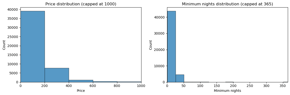 Long right tails in price and minimum nights
Neighbourhood Price Rankings
Grouping by borough and neighbourhood—and keeping only neighbourhoods with more than 5 listings—I pulled the top 5 and bottom 5 neighbourhoods by average price within each borough, 50 in total. At the borough level, Manhattan leads on average price, followed by Brooklyn, with Queens, the Bronx, and Staten Island noticeably cheaper.
neighbourhood_stats = (
df_clean
.groupby(['neighbourhood_group', 'neighbourhood'])
.agg(avg_price=('price', 'mean'), listings_count=('id', 'count'))
.reset_index()
)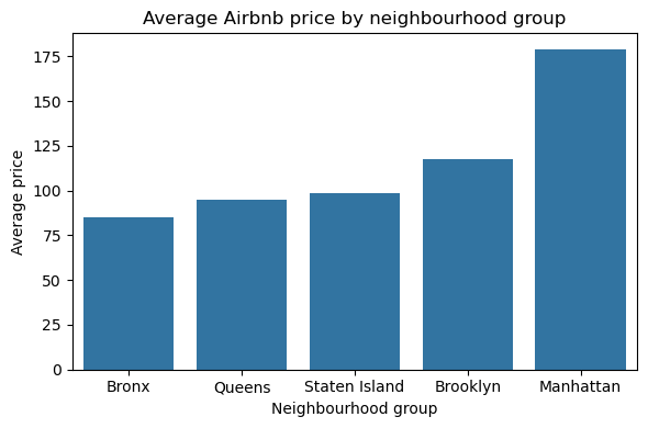 Manhattan and Brooklyn lead on price
Correlation Analysis
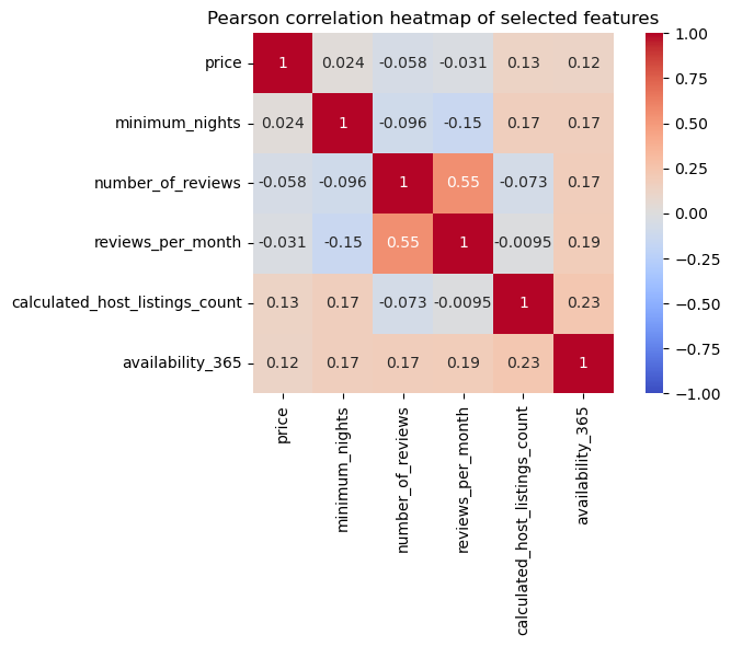
A Pearson correlation heatmap across six numeric features showed the strongest
relationship between number_of_reviews and reviews_per_month (about
0.55), with weaker positive links between host listing counts, availability, and
review activity. Notably, price shows almost no linear relationship with any other
feature—a useful finding, since it means price cannot be explained by these variables alone.
 Review activity correlates; price does not
Geography, Price, and Reviews
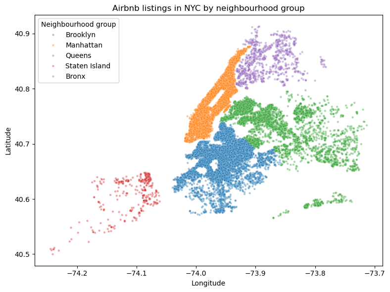
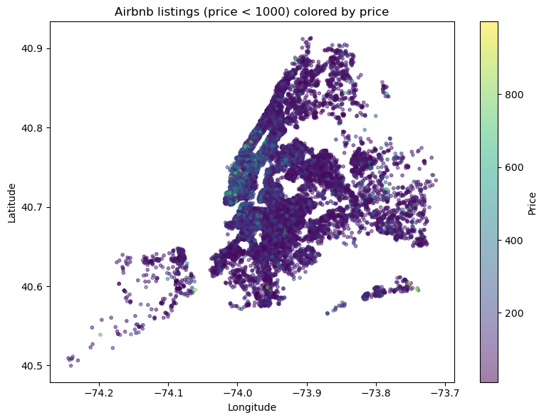
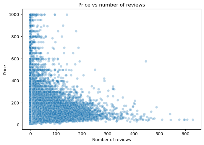
Plotting latitude and longitude recreates the shape of New York City from listing density alone. Colored by borough, Manhattan and Brooklyn appear as dense cores while Queens, the Bronx, and Staten Island spread thin; re-coloring the same points by price makes the Manhattan premium obvious. Comparing price against review counts adds the other half of the story—heavily reviewed listings sit at moderate prices, while expensive listings collect far fewer reviews.
 Price vs. number of reviews
Text Analysis with Word Clouds
Joining all 48,631 listing names into a single string and generating a word cloud (with "nyc", "new", "york", and "airbnb" added to the stopword list) surfaced how hosts market their spaces. Words like "bedroom", "room", and "private" dominate, showing that room type and privacy are the headline selling points.
stopwords = set(STOPWORDS)
stopwords.update(["nyc", "new", "york", "airbnb"])
wordcloud = WordCloud(
width=800, height=400, background_color="white",
stopwords=stopwords, collocations=False
).generate(text)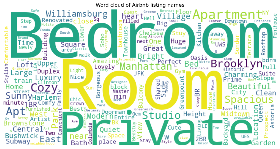 Most common words in listing names
Who Actually Hosts in NYC
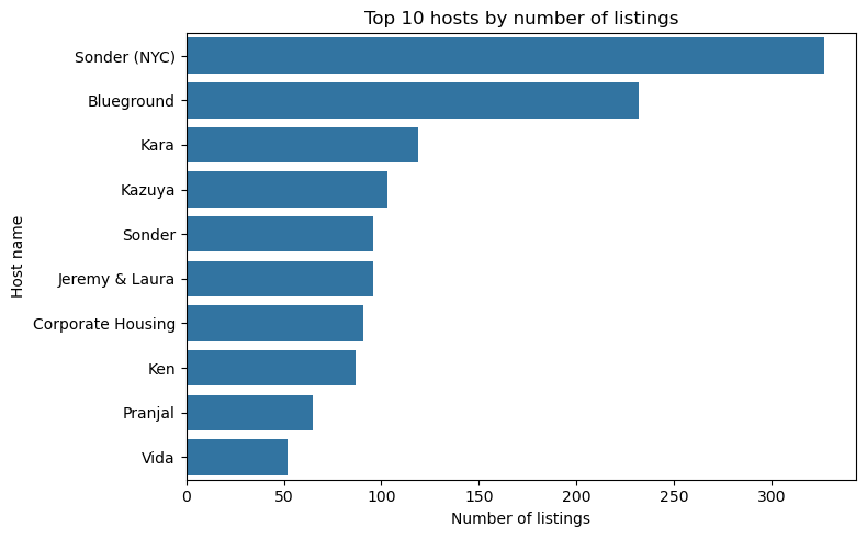
Ranking hosts by listing count revealed that the busiest accounts are not individuals at all— Sonder (NYC) and Blueground each manage around 100 or more properties, far above the typical host with one or two. The top of the NYC market is effectively corporate operators running large portfolios.
 Top 10 hosts by listing count
Market Concentration by Borough
Manhattan and Brooklyn each carry roughly 20,000 listings, Queens around 5,000, and the Bronx and Staten Island barely register—Airbnb activity in NYC is heavily concentrated in the tourist-facing boroughs.
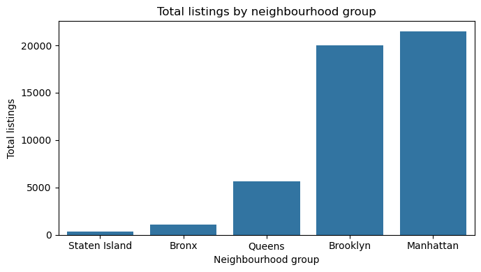 Total listings by borough
Room Type Mix
Breaking listings down by room type within each borough showed a clear split: entire home/apartment listings dominate Manhattan and Brooklyn, while private rooms outnumber whole apartments in Queens and the Bronx—a real difference in how hosting works outside the tourist core.
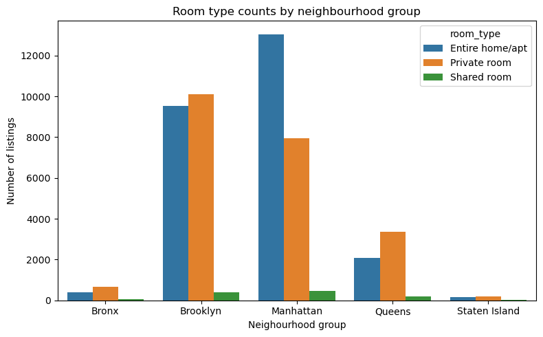 Room type counts by borough
Technologies Used
View Source Code
View on GitHubWorld Happiness Analysis
Five Years of Data, Three Models, One Custom Happiness Formula
About the Project
This project asks what actually makes people in different countries happy, using World Happiness Report data from 2015 through 2019. I merged five separately formatted yearly datasets into one panel of 782 country-years, explored how happiness relates to GDP, social support, health, freedom, generosity, and corruption, then trained three machine learning models on 2015–2018 to predict the 2019 rankings. I finished by writing my own weighted happiness formula and comparing its ranking against the official one.
Technical Highlights
The work moved from messy source files, through EDA, to model comparison:
Standardizing & Merging Five Datasets
Each year used different column names for the same variables (Happiness Rank,
Happiness.Rank, and Overall rank all mean the same thing). I renamed every
file to a shared schema, added a Year column, and used reindex so missing
columns became NaN instead of breaking the concatenation. The result is a single tidy
DataFrame of 782 rows and 11 columns.
common_cols = ["Country", "Year", "Rank", "Score", "GDP",
               "Social_support", "Health", "Freedom",
               "Generosity", "Corruption", "Region"]

df_all = pd.concat(
    [df.reindex(columns=common_cols) for df in yearly_frames],
    ignore_index=True
)
Rank Stability Over Time
Restricting to countries present in all five years, I pivoted ranks into a country-by-year table and measured both the standard deviation of each rank (stability) and the 2015 to 2019 change (improvement). New Zealand, Australia, Iceland, Denmark, and the Netherlands barely move at all, while Benin, Ivory Coast, Honduras, Hungary, and Gabon climbed the most over the five-year window.
rank_stats = df_panel.pivot_table(
    index="Country", columns="Year", values="Rank"
)

rank_stats["rank_std"] = df_panel.groupby("Country")["Rank"].std()
rank_stats["rank_change"] = rank_stats["Rank_2015"] - rank_stats["Rank_2019"]
What Correlates with Happiness
Scatter plots and a correlation matrix pointed to three dominant predictors: GDP per capita (r ≈ 0.79), social support (r ≈ 0.75), and healthy life expectancy (r ≈ 0.70). Freedom follows at roughly 0.5, while corruption (about 0.43) and generosity (about 0.16) matter far less. Average world happiness itself stayed remarkably flat across the period, moving only between about 5.35 and 5.41.
Model 1: Linear Regression (Baseline)
Training on 2015–2018 and testing on 2019 gave a mean absolute error of 0.42 and an R² of 0.75, translating to an average error of about 15–16 places when predicted scores are converted back into rankings. A clean, interpretable benchmark, but with visible spread among the lowest-scoring countries.
feature_cols = ["GDP", "Social_support", "Health",
                "Freedom", "Generosity", "Corruption"]

train_df = df_all[df_all["Year"] < 2019]   # 2015-2018
test_df  = df_all[df_all["Year"] == 2019]  # held-out year

linreg = LinearRegression().fit(X_train, y_train)
# MAE: 0.42 | R2: 0.75 | mean rank error: ~15
Model 2: Random Forest
The flexible, non-linear model actually performed worse than the baseline—MAE 0.48, R² 0.71, average rank error about 17. With only around 150 countries per year and relationships that are close to linear to begin with, the extra capacity of an ensemble of trees had nothing to exploit. A useful reminder that a more complex model is not automatically a better one.
rf = RandomForestRegressor(
    n_estimators=200,
    max_depth=5,
    min_samples_leaf=3
).fit(X_train, y_train)
# MAE: 0.48 | R2: 0.71 | mean rank error: ~17
Model 3: KNN Regression (Best)
Distance-weighted k-nearest neighbours with k = 10 won outright: MAE 0.38, R² 0.80, and an average rank error of about 14 places. Predicting a country from the countries most similar to it in feature space beat both alternatives, though all three models struggled with the same low-scoring countries.
knn = KNeighborsRegressor(
    n_neighbors=10,
    weights="distance"
).fit(X_train, y_train)
# MAE: 0.38 | R2: 0.80 | mean rank error: ~14
A Personal Happiness Formula
Finally, I built my own weighted score that leans harder on social support and health than the official index does, and re-ranked the 2019 countries with it. The shifts are dramatic in places: Singapore jumps from 34th to 1st, while Finland drops from 1st to 10th. Countries with strong health and economic profiles relative to their reported score gain the most.
custom_2019["MyScore"] = (
    0.20 * custom_2019["GDP"] +
    0.25 * custom_2019["Social_support"] +
    0.25 * custom_2019["Health"] +
    0.15 * custom_2019["Freedom"] +
    0.05 * custom_2019["Generosity"] +
    0.10 * custom_2019["Corruption"]
)

custom_2019["MyRank"] = custom_2019["MyScore"].rank(
    ascending=False, method="first"
).astype(int)
Conclusions
Across both the EDA and the models, social support, life expectancy, and GDP per capita consistently came out as the strongest numeric drivers of national happiness, with freedom playing a secondary role and generosity and corruption contributing comparatively little. If the goal were to raise a country’s happiness, the data points squarely at strengthening the social safety net and expanding access to healthcare before anything else.
Technologies Used
View Source Code
View on GitHubLinear Regression Analysis
Multiple Imputation & Lack-of-Fit Testing in R
About the Project
This project explores the relationship between an independent variable (IV) and dependent variable (DV)
through two distinct analytical approaches: multiple imputation for missing data (Part A)
and transformation with lack-of-fit testing (Part B). Both analyses were conducted in
RStudio using statistical packages like mice and alr3.
Part A: Multiple Imputation & Linear Regression
The first analysis tackled a common real-world problem: missing data.
Rather than simply deleting incomplete cases (which can bias results), I used the mice
package to perform multiple imputation—a statistically rigorous method that estimates missing values
based on observed data patterns.
Data Preparation & Merging
The dataset was split across two CSV files (one for IV, one for DV), requiring a merge operation by subject ID. This is common in research settings where different measurements are collected separately.
PartA_IV <- read.csv("data/partA_IV.csv", header = TRUE)
PartA_DV <- read.csv("data/partA_DV.csv", header = TRUE)
PartA <- merge(PartA_IV, PartA_DV, by = "ID")
Exploring & Visualizing Missingness
Before imputation, I examined the missing data patterns using md.pattern().
This revealed that of 574 total observations, 449 had complete data, while 60 were missing DV values,
59 were missing IV values, and 6 were missing both. Understanding these patterns is crucial for
choosing an appropriate imputation method.
any(is.na(PartA$IV))  # Check for missing IV
any(is.na(PartA$DV))  # Check for missing DV
md.pattern(PartA)     # Visualize missingness patterns
Multiple Imputation with MICE
The MICE (Multivariate Imputation by Chained Equations) algorithm was used with
the norm.boot method, which assumes normal distributions and uses bootstrapping for
uncertainty estimation. This creates multiple plausible datasets, accounting for the uncertainty
inherent in imputed values.
# Keep rows with at least one observed value
PartA_imp <- PartA[!is.na(PartA$IV) | !is.na(PartA$DV), ]

# Run multiple imputation
imp <- mice(PartA_imp, method = "norm.boot", printFlag = FALSE)

# Extract completed dataset
PartA_complete <- complete(imp)
Linear Model & Results
With the complete dataset, I fit a simple linear regression model: DV ~ IV. The results were striking—the model explained 73.4% of the variance (adjusted R² = 0.7347), with a highly significant F-statistic of 1571 (p < 2.2e-16).
M <- lm(DV ~ IV, data = PartA_complete)
summary(M)
# Slope: 5.16 | Intercept: 28.36
# 95% CI for IV: [4.90, 5.41]
The estimated slope of 5.16 means that for every 1-unit increase in IV, DV increases by approximately 5.16 units. The narrow 95% confidence interval (4.90 to 5.41) confirms the precision of this estimate.
Part B: Transformation & Lack-of-Fit Testing
The second analysis addressed a different challenge: what if the relationship between IV and DV isn't naturally linear? This part used variable transformation and data binning to linearize the relationship, then verified the model fit using a formal lack-of-fit test.
Power Transformation
To stabilize variance and linearize the relationship, I applied a y^(-2/3) power transformation to the dependent variable. This is a common technique when the original data shows curvature or heteroscedasticity (non-constant variance).
data_trans <- data.frame(
  xtrans = data$x,
  ytrans = data$y^(-2/3)
)
Binning Strategy
For the lack-of-fit test, I needed replicate observations at each x-value. Since the data
had continuous x-values, I created bins of width 0.3 using cut(), then computed
group means. This allowed the pureErrorAnova() function to separate pure error
from lack-of-fit.
breaks <- c(-Inf, seq(min(xtrans), max(xtrans), by = 0.3), Inf)
groups <- cut(data_trans$xtrans, breaks = breaks)
x_group_mean <- ave(data_trans$xtrans, groups)
Pure Error ANOVA Results
The pureErrorAnova() function from the alr3 package decomposes
residuals into pure error (variation within bins) and lack-of-fit
(systematic deviation from linearity). The key result: p = 0.5504 for lack-of-fit,
which is not significant—meaning the linear model adequately fits the transformed data.
fit_b <- lm(y ~ x, data = data_bin)
pureErrorAnova(fit_b)
# Lack of fit: F = 0.3571, p = 0.5504 (not significant)
# Regression: F = 332.07, p < 2e-16 (highly significant)
The regression F-value of 332.07 (p < 2e-16) confirms a strong linear association after transformation, while the non-significant lack-of-fit test validates that the linear model is appropriate.